Seasons have to be taken into account when choosing paper and considering paper quality for branding. Different seasons call for various qualities in the paper: weight, texture, and most importantly, color. Colors can greatly affect how businesses reach their target audience as many buyers consider color as the primary attraction for businesses trying to market to them.
Fall typically brings to mind warm colors that come directly from nature’s changing shades. The ideal colors for fall evoke visions of changing leaves, coziness, and comfort. Some suggestions include:
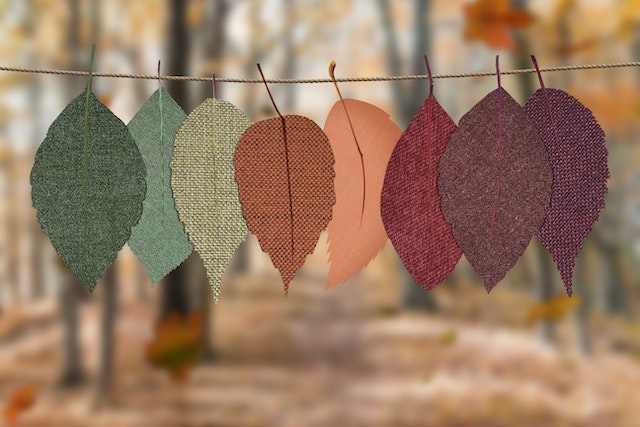
- Foliage
Fall foliage range from rich deep reds and russets to yellows and even greens. Fall’s foliage is so distinct that it’s universally celebrated for its characteristics. Combined with printing on high GSM paper, quality materials may be produced with deep vibrant, and clear colors. Monochromatic and complementary colors help.
- Play with contrasts
The contrasts between sunlight and shadows become more pronounced as afternoons become longer during the season. Use it to your advantage by playing light and dark colors with your fall shades. Ensure that fonts are bright against dark papers and vice versa.
- Harvest time
Another source of liveliness during the fall is harvest season. Produce themes, cottage, and rustic themes, and other “harvest” ideas make great prints during fall. Don’t forget to check the paper quality for photo papers and printed materials—the colors must remain vibrant.
Another great tip is to be creative with textures along with the colors. Handmade or speckled papers combined with fall colors truly lend a unique natural touch to cards, certificates, wrapping papers, and boards, among many other marketing collaterals you may wish to print. Great printing this fall is more than just paper—it’s a sensation for the senses.
Print Time has more tips on how to make your printing stand out from the rest. Visit Printtime.com to learn more.
Leave a reply